All Three Graphics retrieved from the infosthetics website.
The first interactive graphic I’ve chose from infosthetics.com is called Google Maps Gallery Highlights Specialized Maps based on Public Data. This visualization is showing the statistics of fast foods, public population, and world wide maps in general. For example one map shows all the locations of fast food resturants around the world. http://maps.google.com/gallery/details?id=z4f-ZuCLmiKg.kXKuwO813vdU&hl=en The Key shows Subway’s in orange, Mc donalds’s in lavender, Burger King’s in pink, Taco Bell’s in blue, Wendy’s in dark orange, KFC’s in red, Dairy Queen’s in purple, and Arby’s in green. It’s engaging to others including myself because these are everyday fast food restaurants people eat from. It is interesting to know how many restaurants there are and where they are located. The goal is effective because when I look for a location on google the map pops up right away. I would improve the website by brightening some colors in the key because some colors that represent resturants looks similar. I would also make the zoom more accessible to spread out and really be able to click on the restaurant you want to find the location for.
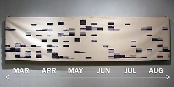
Secondly, I think this graphic is interesting and weird at the same time. This graphic is called Canvas Shows All the Lint Generated by a Clothes Dryer during One Year about this family of four recording the total of lint consumed on there clothes from March to August 2013. Rick Valentine & Rose Marshack is showing their results of a weekly basis of a six months chart (26ft long). They collected the lint from each dryer and needle-felted it to a long canvas. The interactive elements of this video is discovering there DNA pattern based off the lint they collected. I find that very interesting because I wouldn’t have thought to look for DNA in lint myself. The video is very engaging and the structure of the canvas looks like unique art you wouldn’t notice it was a DNA chart created by the lint consumed in this family.
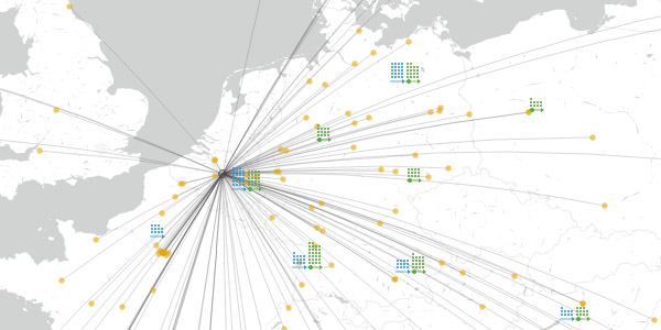
This last graphic I am going to describe is called “Where Students Study Abroad via the European Erasmus Network”, Erasmus is a student exchange program in Europe that allows more than 75,000 European students to go to school in a different country. This is a sight-seeing adventure and amazing school experience, I envy these programs and not being apart of it. (http://erasmus.ahoi.in) The website shows an interactive visualization of the network, chart showing the institutions accepting students, where they are being sent to and from and who is connected with whom. The elements shown in the site is a key on how to read the data base, the person icon symbolizes 100 students, The circle shows the Erasmus institutions, the orange dots shows where they received the students, green dots shows where they are sending students from and the Erasmus icon represents the Erasmus partnership. It is engaging because it shows the population of students doing study abroad and it tells you about the Erasmus program and their goal. I believe their goal is effective because they are sending more 75,000 students away to affiliated programs and I’m sure the students will enjoy the diversity around them and meeting new people. I would improve the chart and make it more simpler to understand. Also I would add other states students and where they are transporting and why.