
Feb 13
Homework #1 ( Three Graphics)
All Three Graphics retrieved from the infosthetics website.
The first interactive graphic I’ve chose from infosthetics.com is called Google Maps Gallery Highlights Specialized Maps based on Public Data. This visualization is showing the statistics of fast foods, public population, and world wide maps in general. For example one map shows all the locations of fast food resturants around the world. http://maps.google.com/gallery/details?id=z4f-ZuCLmiKg.kXKuwO813vdU&hl=en The Key shows Subway’s in orange, Mc donalds’s in lavender, Burger King’s in pink, Taco Bell’s in blue, Wendy’s in dark orange, KFC’s in red, Dairy Queen’s in purple, and Arby’s in green. It’s engaging to others including myself because these are everyday fast food restaurants people eat from. It is interesting to know how many restaurants there are and where they are located. The goal is effective because when I look for a location on google the map pops up right away. I would improve the website by brightening some colors in the key because some colors that represent resturants looks similar. I would also make the zoom more accessible to spread out and really be able to click on the restaurant you want to find the location for.
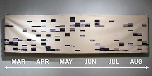
Secondly, I think this graphic is interesting and weird at the same time. This graphic is called Canvas Shows All the Lint Generated by a Clothes Dryer during One Year about this family of four recording the total of lint consumed on there clothes from March to August 2013. Rick Valentine & Rose Marshack is showing their results of a weekly basis of a six months chart (26ft long). They collected the lint from each dryer and needle-felted it to a long canvas. The interactive elements of this video is discovering there DNA pattern based off the lint they collected. I find that very interesting because I wouldn’t have thought to look for DNA in lint myself. The video is very engaging and the structure of the canvas looks like unique art you wouldn’t notice it was a DNA chart created by the lint consumed in this family.
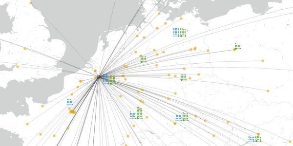
This last graphic I am going to describe is called “Where Students Study Abroad via the European Erasmus Network”, Erasmus is a student exchange program in Europe that allows more than 75,000 European students to go to school in a different country. This is a sight-seeing adventure and amazing school experience, I envy these programs and not being apart of it. (http://erasmus.ahoi.in) The website shows an interactive visualization of the network, chart showing the institutions accepting students, where they are being sent to and from and who is connected with whom. The elements shown in the site is a key on how to read the data base, the person icon symbolizes 100 students, The circle shows the Erasmus institutions, the orange dots shows where they received the students, green dots shows where they are sending students from and the Erasmus icon represents the Erasmus partnership. It is engaging because it shows the population of students doing study abroad and it tells you about the Erasmus program and their goal. I believe their goal is effective because they are sending more 75,000 students away to affiliated programs and I’m sure the students will enjoy the diversity around them and meeting new people. I would improve the chart and make it more simpler to understand. Also I would add other states students and where they are transporting and why.
Feb 13
Homework 2/13
The first site is called Bit – Planner .com . The visualization of the site is trying to demonstrate how their digitize wall mount Lego planner works. The interactive element of the design of the site are the video and pictures that show step by step how their invention works. Their site keeps the audience engaged by showing a very descriptive video other than using text. Also, the pictures were very high in resolution. Yes, I believe their goal is very effective because I wasn’t confused on how and what their invention purpose was for. I wouldn’t add many improvements to the site. Perhaps, making their side information menu more interactive by putting virtual Legos.
The second website is called Hubcab.org. The visualization provides useful information for people traveling in taxicabs around the city by making it manageable to identify zones to minimize pickup and drop offs to their destination. The interactive elements of the design of the site are the interactive map, the tutorial, interactive time frame. Hubcab.org keeps their audience engaged by providing an easy to use interactive tutorial and it increases more social interactions. Yes, I believe their goal is effective. It’s easy to comprehend how their innovative idea works.
The third site is called Periscopic.com. The visualization of their website was very appealing. The main page showed very raw depth visualization of political, history, social media and health data. The data on the causation of breast cancer, was very informative because it would help people understand all factors of everyday life, that can increase or decrease the chances of getting breast cancer. Also, it can help rule any wrong misconceptions of the disease. The interactive elements of the design of the site is the video that provides in depth data that enables you to select individual psychological factors and help you understand the strengths of it . The site keeps their audience engaged because it’s very detailed and it provides definitions to further enhance people’s knowledge. Yes, I think their goal is very effective because it can possibly be life changing for others by having a very in depth understanding on how this malicious disease works. I wouldn’t improve anything, I think it’s very self explanatory.
Feb 13
Homework #1
http://infosthetics.com/archives/2014/03/hubcab_mapping_all_taxi_trips_in_new_york_2011.html
http://hubcab.org/#13.00/40.7219/-73.9484
The website was designed in order to help the city go green. Developers wanted to match the key points in the city that most people travel to and compare travel routes with each other. I found it interesting that they used internet technology to basically track peoples travel locations. Their goal for us is to understand that other people can have the same travel plans or ideas as we do and that it would be ok to share a cab with someone thus lowering the carbon make the air less polluted. Though I feel the idea was great they actual map is a little confusing. I had to read about it more to get the idea which should have been obvious from the beginning in order to be user friendly. If I had made this map I would have had a key or tool bar that indicated what was going on. Maybe even a voice over and a handicap feature as well.
http://infosthetics.com/archives/2013/05/mapping_the_pavement_quality_of_streets_in_la.html
http://graphics.latimes.com/la-streets-map/#10/34.0498/-118.6002
This map was actually really good and also very user friendly. The map was developed by the Los Angeles times data desk. The map shows the grading levels of 68,000 streets in L.A. I think this is genius especially for the elderly who have a hard time getting around. The map had a color range from green(A) to pink(F). The site also has a really cool feature that would allow me to click on a street and it would show me the grade and also the last time it was repaired and inspected. This provides me with information on which streets get forgotten and I find that useful. The only way I could improve this site is by including street view option.
http://chartporn.org/2013/10/24/evolution-of-western-dance-music-2/
http://www.thomson.co.uk/blog/wp-content/uploads/infographic/interactive-music-map/index.html
This map gives an interactive look on how music developed in the western world and then moved to the east, back, and forth. I personally found this map interesting because it allows you to focus on a set time frame and it labels the influences of music with a map in the background. However as time went on I found it hard to keep track and focus on what I was searching for because of all the randomness going on the map. The letters also began to shrink to accommodate fitting everything into one screen. If I had to program this map I would have made it more user friendly and allowed for more slides to be shown. Basically the map needs to be organized a little more.
Feb 13
Homework #1
This is a graph charting films and there influence on the culture through reference. I found this chart interesting as certain lines or what have you from movies become colloquial, they enter into our everyday speech and possibly not even from seeing the film of its origin. Furthermore movies will often reference other movies further confounding the culture.
This is a chart showing the extinction rates of animals on this earth. this chart is interesting in that everyone knows about climate change, everyone knows mass extinction is a pretty bad thing but this chart visually represents where we stand and I feel could hammer home more effectively the fact that we need to change something.
http://infosthetics.com/archives/2014/08/amsterdam_city_dashboard_a_city_as_urban_statistics.html
This is a chart representing the city of Amsterdam in terms of data, I chose this simply because I found it interesting and feel that when looking at something like an entire city you are taken out of the human aspect of it when it is broken down to figures of data and think that it would be interesting to see New York presented in terms of whats in the air, ets.
Feb 13
Interactive Graphics
http://joshworth.com/dev/pixelspace/pixelspace_solarsystem.html
Josh Worth’s map of the solar system demonstrates a scale model of the solar system if the moon were the size of a pixel. You scroll the browser horizontally to the right observing all the planets, moon, and even the sun. The graph’s purpose is the show the scale of the solar system using visual images and an understandable size conversion. There is very little worth changing in this graph. It delivers on it purpose and the writing that the creator leaves in between planets is entertaining.
http://labs.strava.com/heatmap/#5/7.33242/55.69077/blue/bike
Strava Labs’ graphic is a heat map of people running and biking in the world while using a GPS compatible device and uploading their progress to their site. The graph is very accurate due to its use of Google Earth as the map to show the routes. The heat signatures show the routes and the intensity of the color show how often someone travels that path. This graph effectively demonstrates its purpose and in using Google Earth, they already have a well established base to work off of.
http://zatonovo.com/dataviz/baby_names
Zato Novo’s graph allow a person to type in any name and the graph shows how popular that name was in every state from 1910 to 2012. Using percentages based on total population every state is highlighted according prevalence. The graphic reaches its goal due to its use of the United States census to base its data off of. If I had to change something with this graphic, it would be to add a slider in order to find a specific year rather than go through every year.
Feb 13
Homework #1: 3 interactive graphics
The first graphic I’m doing is called Selfie City. In this day and age, everyone we know or heard of takes a selfie wherever they are at. It just simply means that you are taking a photo of yourself by yourself. This visualization shows tens of thousands selfies that were made over from 5 different cities alone which are New York, Sao Paulo, Berlin, Bangkok and Moscow. The visualization is simply providing quick access to all different types of females whether heavily left-leaning, widely smiling, glasses-wearing. However, significantly females take more selfies than men the interactive elements of the design of this site are image plots, bar graphs, an interactive dashboard and other data graphics. This engages with the audience because it shows the creation of different types of selfies made and even shows what city the most are shot in. I would not change to much about the site besides taking away all the different advertisements shown around the graph.
The second graphic I chose is called Youtube trends: the most popular videos by location. This is a visualization of the most viewed and shared videos in various regions across the United States during the last 12 to 24 hours. The main goal in posting videos on youtube is to have them viewed by as many people across the globe as possible. On the other hand this graphic shows different ranges from it being suitable for everyone down to certain ages. The interactive elements of this design shows a series of horizontal bar graphs, each representing a graphical summary of the top videos for a different demographic. This engages with the audience because it shows a wide variety of what kind of video you can post on youtube letting you know that everyone has a different type of audience when viewing videos, it seems effective in the role. I would improve on this site simply by making the chart bigger and have the thumbnails color coordinated to separate the different types of viewed videos.
My third graphic I chose is on an iPad app that provides info graphic interface for the quantified self. This free iPad app basically makes it easier for people with tracking, logging and analyzing your activities a visual experience. This visualization is useful for a person that likes to sort all of their personal data, whether it is from how many books you have read, diet plans, dates or important information you have for someone really special. The interactive elements in the design of this site is the colorful theme of the bubbles, pie charts and circles that are coated in various playful animations. This engages with the audience simply because everyone can use an app that stores your own personal data and information in, so no one but yourself sees it. I think it is very effective in its goal. I would not do too many changes to the design of this site but remove the advertisements again because I feel it distracts the person from looking at the graphic.
Feb 13
3 Graphs: 2/13/15
This graph here shows the total attacks made between 1970-2013 of various terrorist groups. From Boko Haram to Al-Qa’da. Roughly 56% of deaths from terrorist groups were committed by these 25 groups. The highest number of people killed was 6,857 in 2013.
In Metrico by Digital Dreams we see how math and puzzle platform come together in a unique way. You’re every move dictates what happens next. Whether you move forward or backward, jumping up or down; you have control over the world around you. From what I read, despite its premise being excellent the clunky control makes this puzzle game a miss on the Playstation Vita.
In 2011 if you caught a cab in New York City, there was a good chance that your cab was recorded and documented in HubCab. In HubCab over 13,000 cabs were recorded taking and dropping off passengers throughout the city. And highlighted in various colors depicting whether someone was dropped off or picked up. This experiment was made for the “shareabitlity networks” that allowed efficient optimization for trip sharing opportunities. In other words carpooling with cabs.


